Circles WP – developing and customization the block theme (WordPress)
I started developing the block theme in September 2024. The trigger was the idea of using a background graphic in the templates. You can see the result here on haurand.com – because we have already completed the relaunch of GeneratePress to Circles WP. It was a lot of fun and I learned a lot from it. The theme has already been published in the WordPress repository and can be downloaded free of charge.
FYI: This is the translation of the following post regrading Circles WP in german language. Hier geht es zur deutschsprachigen Version des Beitrags
The theme is lightweight and therefore extremely fast. Circles WP is already prepared for a accessibility-ready website. The font used is Lexend – an accessible font – as standard. Alternatively, the Atkinson Hyperlegible Font – Braille Institute (also accessibility-ready) or „System Font“ are available. Circles WP was deliberately developed without any additional CSS, i.e. I only use the settings of the block editor.
Check Theme Circles WP
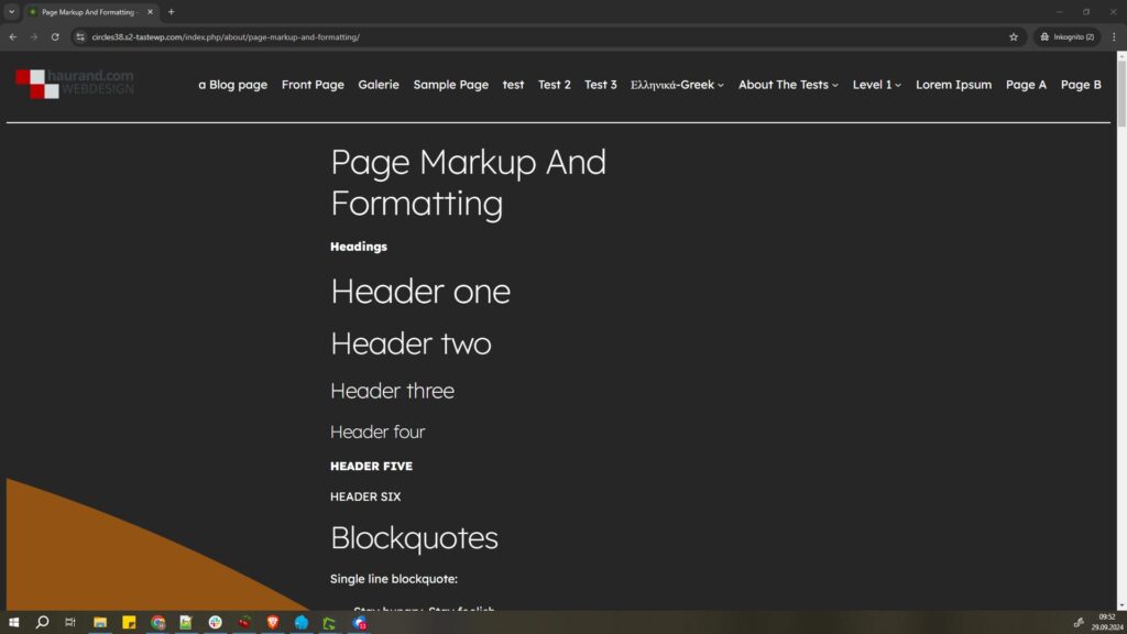
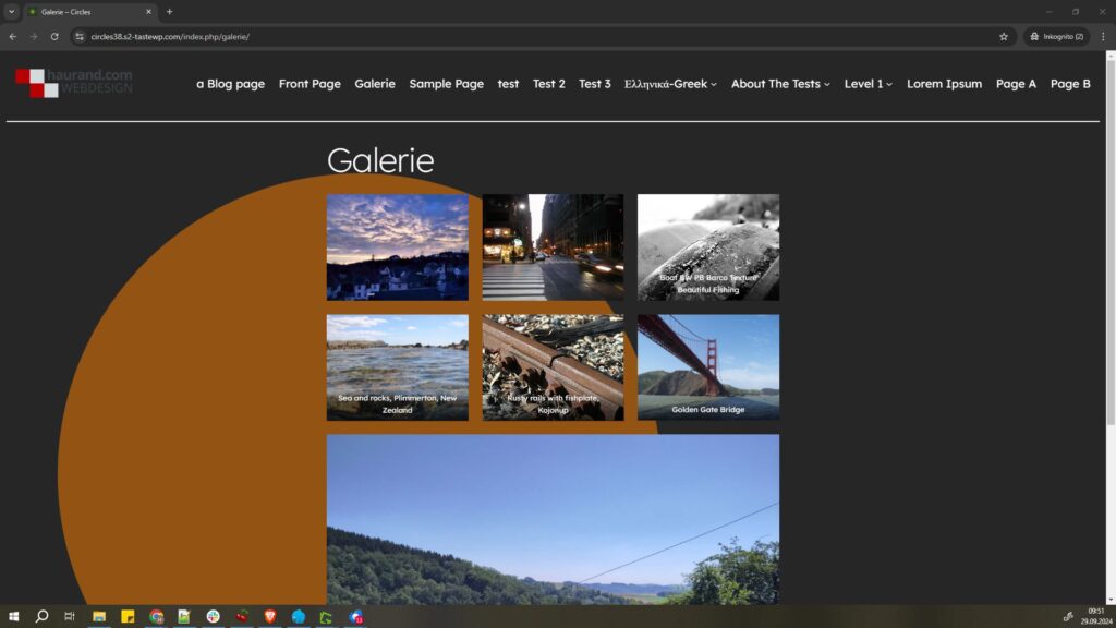
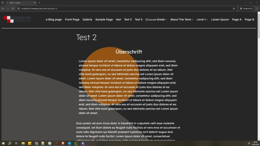
On the following test website you can see the Circles WP with the default style and without any customizations.
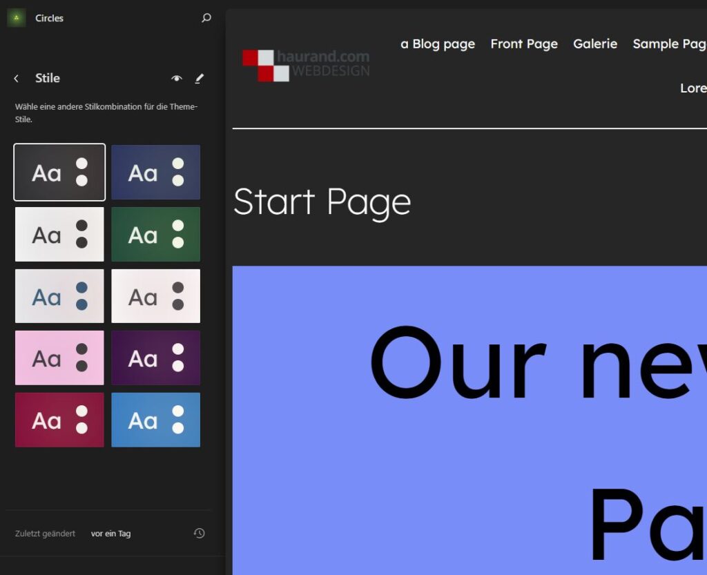
Here is the representation with the different styles:
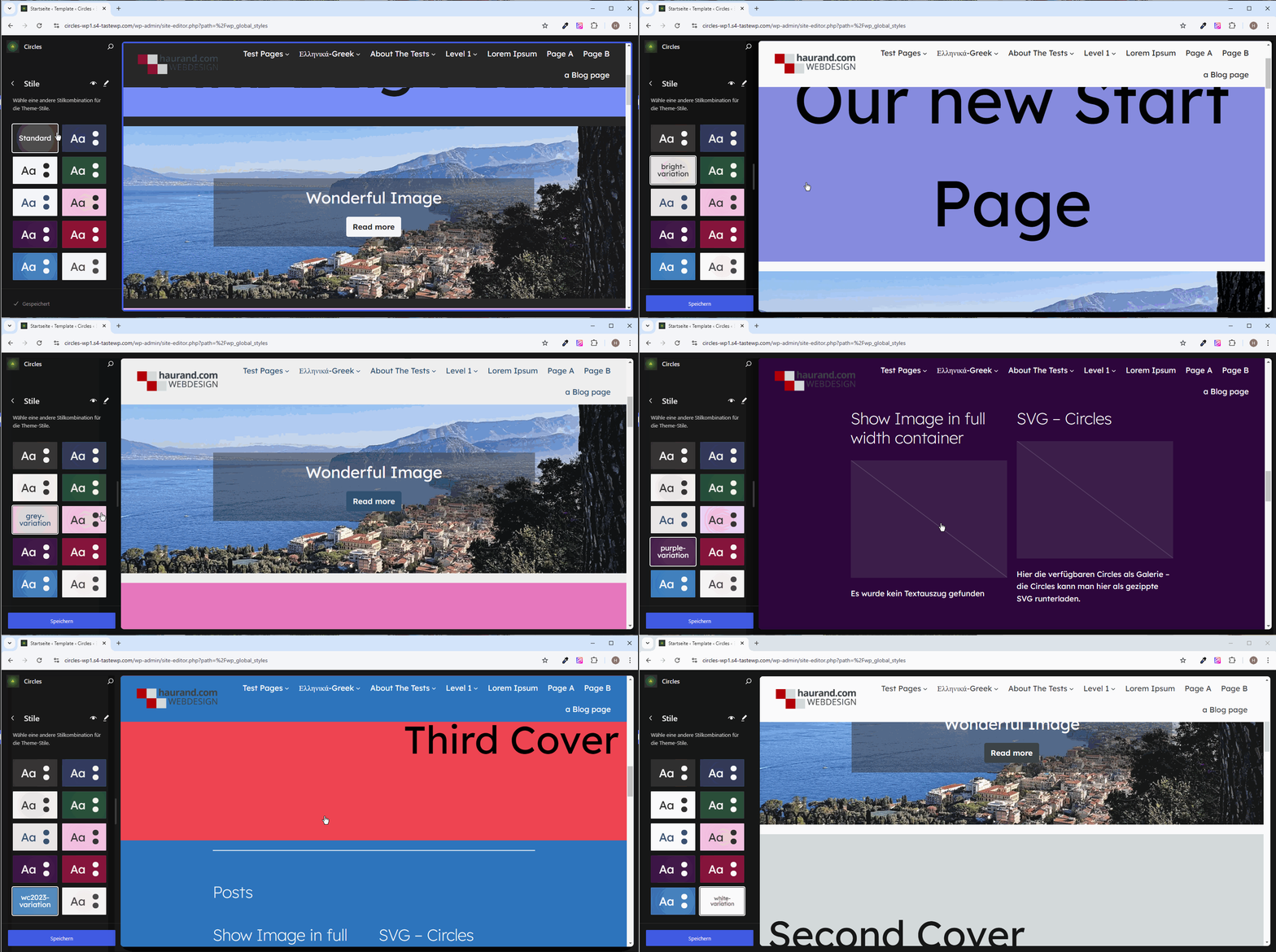
If you want to test the theme yourself without creating your own website, Playground is a good option. Here is the link to a blueprint with Playground, which also contains the test data you see above.
Circles WP: Accessibility Ready – Extensions
Unfortunately, the release would have taken weeks, if not months, until the theme had been checked for the tag „accessibility-ready“. For this reason, after consulting with the reviewer of the theme team, I decided to remove the tag „accessibility-ready“ for now. This tag ensures that you can filter for accessible themes in the WordPress repository.
Of course, additional things are conceivable, such as:
Circles WP contains 10 styles with different color patterns and should be as accessible as possible.
The plugin Theme Check only reports two warnings, but these can be ignored. The theme unit tests was also successful.
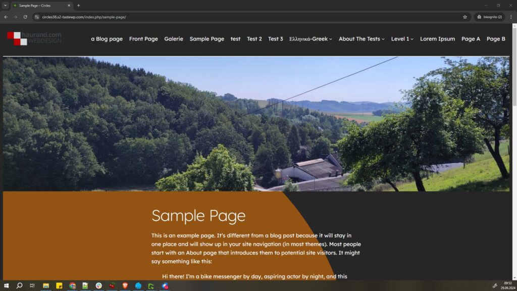
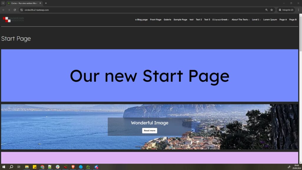
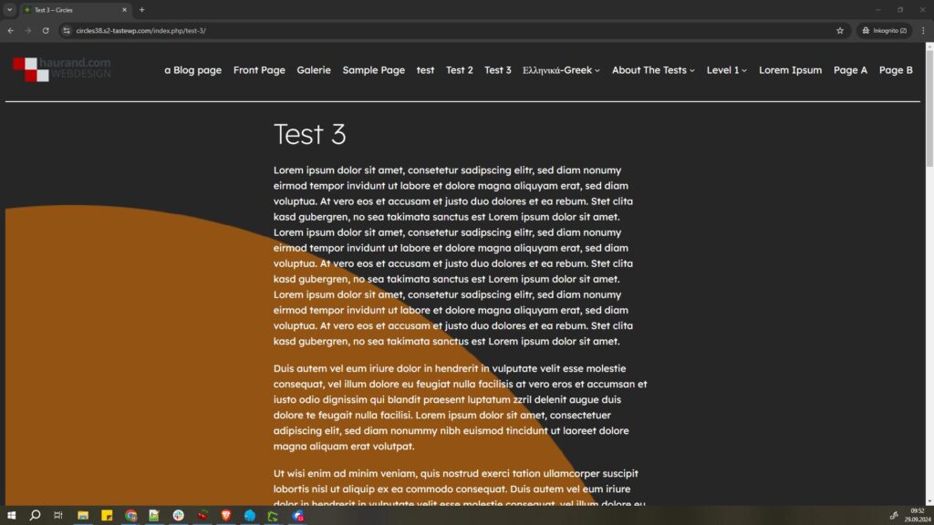
Further information in English
You can find more information about the theme on the following page. This post primarily contains tips on customizing the theme.
Disclaimer:
The provided block theme Circles WP is provided without any express or implied warranty. We assume no liability for damages or problems arising from the use of the theme. The use of the theme is at your own risk. No guarantee is given for the functionality, security or compatibility with other plugins or themes. Before installation and use, it is recommended to back up the website. The theme can be downloaded free of charge from the WordPress repository. Incidentally, a WordPress theme such as Circles WP must first „pass“ a review (a type of quality check) in order to be listed in the WordPress repository.
Theme customizations
Please make sure to create a backup before making any of the changes listed below. It is also a good idea to create a child theme, e.g. using the „Create Block Theme“ plugin, because otherwise the following changes will be lost, e.g. if the theme is updated.
Child Theme with „Create Block Theme“
The background graphics in the styles are already set up in such a way that in most cases the best result is achieved for all styles in terms of accessibility. For example, if you use the gray circle, this will not work for some styles (e.g. the light styles) because the font color (dark) is very difficult to see on the gray background color. So you should definitely consider this in advance. Hence the prior backup.
To do this, first install the “Create Block Theme” plugin. Then you create a child theme via Design > Editor.
I show how this works in the following short video:
When creating the child theme, you can also specify the metadata for the theme if you wish: „Additional Theme MetaData“. The option is located under the field where you enter the name of the theme.
Recommendation: Do not click on „Save Changes to theme“ beforehand (at the top of the menu that appears when you click on the „wrench“).
Change the height of the circle
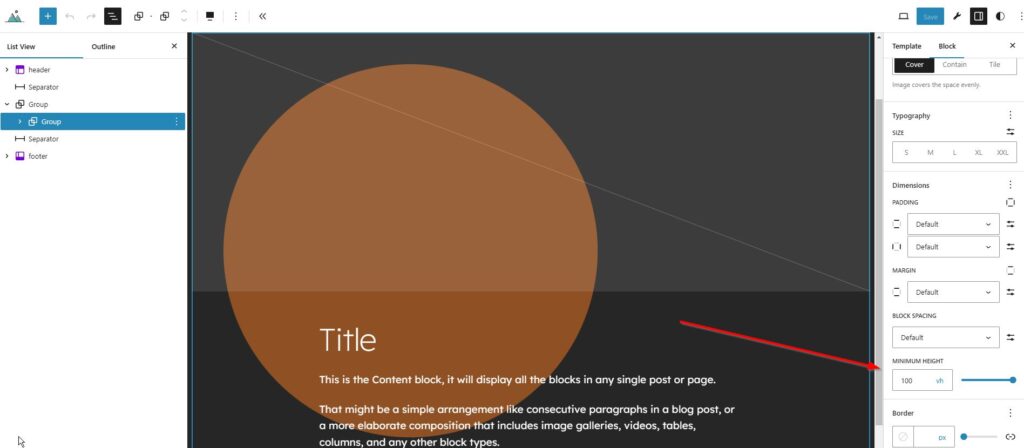
If the height of the circle in the template ( 100vh) is too high for you, you can simply change the height in the corresponding template at the marked point via Design > Website Editor, e.g. to 50vh::
Change background graphics via the code editor
If you want to replace the background graphic (circle_light_orange.svg) with another background graphic, you can currently only change this in the respective template via the code editor.
The following “built-in” graphics are possible::
circle_light_yellow.svgcircle_light_orange.svgcircle_blue.svgcircle_light_blue.svgcircle_green.svgcircle_red.svgcircle_white.svgcircle_grey.svgcircle_very_light_grey.svgcircle_very_dark_grey.svg
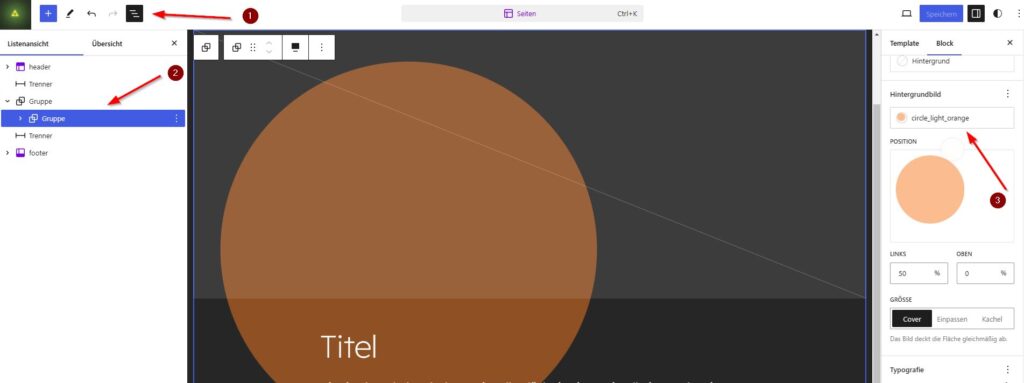
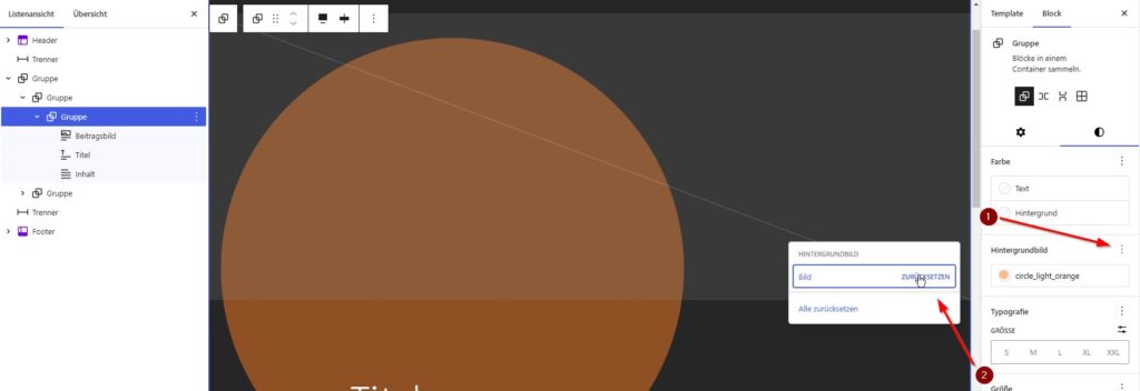
Screenshot 1: In the list view (1) the graphic is in the embedded group (2). On the right in the properties of the group block you can see the background image circle_light_orange.
If you just want to change the position, you can do that right there.
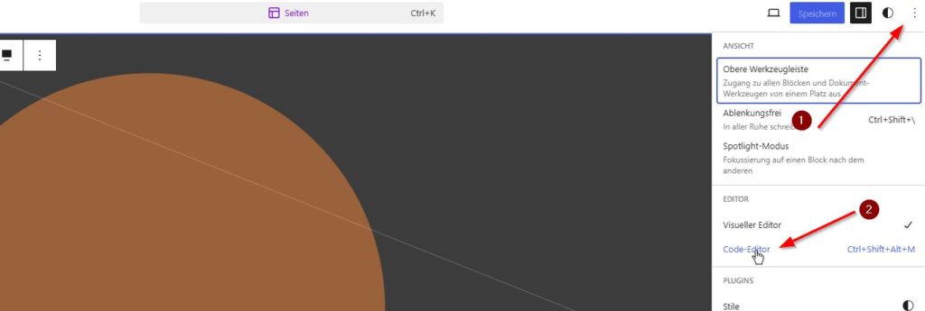
Regarding screenshot 2: If you want to replace the graphic, you have to open the code editor via the kebab menu (three vertical dots) (1). Then click on the link to the code editor.
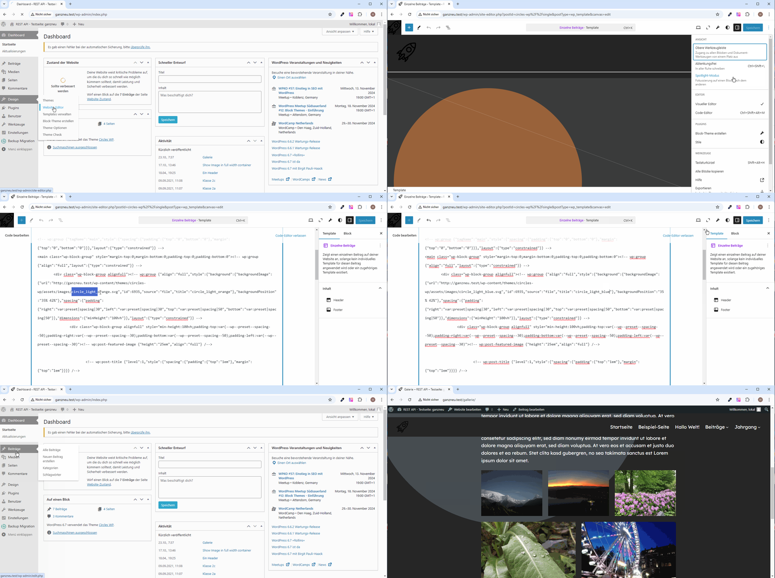
In the following short video I show how to replace the orange circle in the template for the individual posts with a light blue circle. Due to the transparency settings, the circle looks more brown than orange due to the background color (in this case almost black). With other styles (e.g. with a green background) the circle has a different color tone.
Let’s assume that the orange circle should be replaced by a light blue circle. In this case, the light blue looks more like grey. Here I show how to replace the SVG graphic in the code editor:
Original with circle_light_orange.svg:
<!-- wp:group {"align":"full","style":{"background":{"backgroundImage":{"url":"http://ganzneu.test/wp-content/themes/circles-wp/assets/images/circle_light_orange.svg","id":6935,"source":"file","title":"circle_light_orange"},"backgroundPosition":"35% 42%"},"spacing":{"padding":{"right":"var:preset|spacing|30","left":"var:preset|spacing|30","top":"var:preset|spacing|50","bottom":"var:preset|spacing|50"}},"dimensions":{"minHeight":"100vh"}},"layout":{"type":"constrained"}} -->After change with circle_light_blue.svg:
<!-- wp:group {"align":"full","style":{"background":{"backgroundImage":{"url":"http://ganzneu.test/wp-content/themes/circles-wp/assets/images/circle_light_blue.svg","id":6935,"source":"file","title":"circle_light_blue"},"backgroundPosition":"35% 42%"},"spacing":{"padding":{"right":"var:preset|spacing|30","left":"var:preset|spacing|30","top":"var:preset|spacing|50","bottom":"var:preset|spacing|50"}},"dimensions":{"minHeight":"100vh"}},"layout":{"type":"constrained"}} -->If you want to make this change to other templates (e.g. pages), you have to proceed in a similar way.
Another example of replacement by grey circle
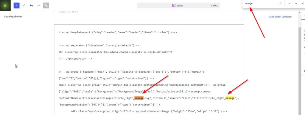
In the code editor, it is best to search for the places where the graphic is located in the desired template. You can also use the browser’s search function to do this. Two places are found. Here you enter the exact name of the desired graphic, e.g. in grey: The name is replaced circle_light_orange.svg by circle_grey.svg in both places.
You can then click on the link “Exit code editor”. Finally, the modified template must be saved using the “Save” button at the top right.
Delete background image
If you don’t want to have a background graphic, all you need to do is click on “Reset” under “Background image” in the following menu in the group via the kebab menu (three vertical dots).
Change background graphics via the block editor
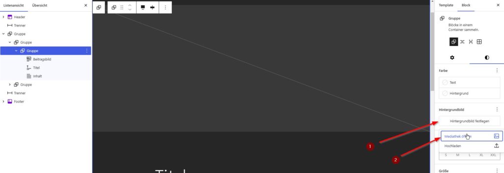
It is also possible to make changes using the block editor. However, you have to download the SVG graphics to your own computer and then upload them to the media library. Once you have unpacked the ZIP file on a local computer, you can upload the files to the media library and use them as usual. However, this is only possible if you use a corresponding plugin such as Easy SVG Support or a code snippet, because otherwise SVG graphics cannot be uploaded to the media library.
Once you have uploaded the SVG graphic, you must first delete the background graphic in the respective template (e.g. individual post or page) in the group block by resetting the background graphic (see also the screenshot above). You can then select the desired background graphic from the media library.
Change the position of the circle
By changing the position (see screenshot below) you can also move the circle. You can change this individually and achieve a different effect:
Using background graphics – alternatives
Of course, you also have the option of using your own background graphics. However, PNG or JPG files are much larger than SVG files. For this reason, the circles are used as SVG files.
When it comes to background graphics, you should generally remember that, for the sake of readability and accessibility, only single-coloured patterns or graphics should be used and, on the other hand, the contrast between the background colour and the font colour should be taken into account. The free app Colour Contrast Analyser is suitable for checking contrasts .
Undo changes
If you don’t like the changes to the template, the easiest way is to reset the change via Design > Website Editor for the respective template:
If you only want to reset the last change, you can also use the “Show revisions” option to switch to the last revision that was OK.
More Patterns
If the patterns that come with Circles WP are not enough for you, then I would like to point out a large library of patterns. This library contains a lot of very interesting patterns that you can use for free. I will write a separate post about this.
New Options in Circles WP 1.0.6 – published at the beginning of January 2025
== Changelog == = 1.0.6 =
- Released: January 1, 2025
- Added: New styles for paragraph with different Color and Background Color, so that links can be displayed as buttons if necessary: Link as Button
- Added: New styles for paragraph with different Color and Background Color
- Enhancement: Further information on customization with link in readme.txt
New style-variations are created for the paragraph block so that the paragraph block can easily be given a different background color.
Another interesting feature is the new style variation option that allows you to display links as buttons. The background to this is that buttons are used to trigger actions, such as submitting a form or opening a dialog.
Links, on the other hand, navigate to other pages or sections within a page.
When buttons are used as links, this can be confusing for users of screen readers, for example.
These technologies interpret buttons and links differently and give corresponding instructions to users. Incorrect use can lead to misunderstandings and make navigation more difficult.
Buttons and links also differ in their keyboard navigation. Links can be accessed with the Tab key and activated with the Enter key, while buttons can also be activated with the space bar.
This inconsistency can make operation difficult for users who rely on the keyboard.
In order to design an accessible website, it is important to use buttons and links according to their intended functions and to clearly differentiate between them.
When using links designed in this way, you should ensure that the background color has sufficient contrast in relation to the font color. Not all style variations are suitable for these links, depending on the style selected.
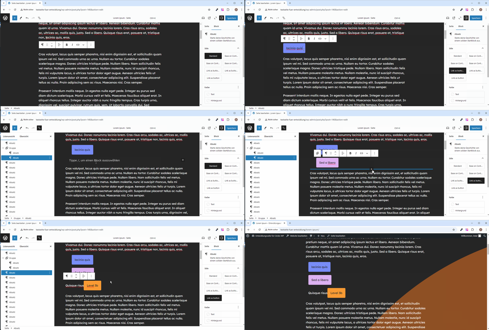
Here a preview of this new options:
Since it is not obvious how to create links as buttons with the styles, here is a short video to explain:
Unfortunately, the color display is not visible on the right in the properties for the styles „links as button“.
Do you use our Circles WP theme? – We would be delighted if you let us know.
If you use Circles WP on a website, we would be delighted to receive feedback. It would be great if you write a comment. Thanks a lot.
If you would like to receive detailed information about Circles WP (e.g. updates) directly in the future, we recommend our free newsletter.
Plugin „Dynamic Header & Navigation for Block Themes“
30.5.2025: For a more professional presentation of the navigation with Block Themes, e.g. Circles WP, I recommend my plugin https://wordpress.org/plugins/shrinking-logo-sticky-header/
Conclusion
I have to admit that the development took a lot of time. The structure of Twenty Twenty-Four was particularly helpful for me. There were always things that didn’t work out the way I imagined. In the end, development isn’t quite that easy. But it was worth it because I have a better understanding of the structures and code of block themes and have documented everything well for myself. I’m very happy to receive tips on errors, suggestions and feedback on Circles WP . 🙂
If you have any questions about the theme or the customizations, please feel free to ask them in the theme’s support area. I will then answer as quickly as possible.
Have you created a website with Circles WP? – Feel free to write the link in the comments. I’m excited to see your website. 🙂
If you don’t want to make the adjustments yourself or need individual changes, please send us an email. We will be happy to make you an offer.
Links, sources and current information
- Websites with Circles WP (apart from haurand.com, of course):
- An example website with various customizations:
https://space4.yd-sgs.de/ - An accessible website that we created as a customer project in 2/2025:
https://zaw-koeln.de/
- An example website with various customizations:
- Block Theme Circles WP – Entwicklung und Anpassung (german version of this post)
- Another Layout with Circles WP:
https://haurand.com/circles-wp-block-theme/#h-another-layout-with-circles-wp - Changelog Circles WP:
https://haurand.com/wp-admin/post.php?post=13169&action=edit#h-changelog-circles-wp - Circles WP in WordPress Repository:
https://wordpress.org/themes/circles-wp/
https://wordpress.org/themes/circles-wp/preview/?style_variation=Default - Circles: Download graphics as SVG graphics:
https://haurand.com/wp-content/uploads/2024/11/circles_svg.zip - Easy SVG Support from Benjamin Zekavica
https://de.wordpress.org/plugins/easy-svg/ - Installing Plugin Theme Check
- Theme Handbook
- Developing with WordPress Forum
- Theme Unit Tests
- Theme Test Data -Formerly Theme Unit Testhttps://github.com/WordPress/theme-test-data
- Make sure to review the guidelines at Theme Review before uploading a Theme.
- Building My First WordPress Block Theme – part 1: https://www.askdesign.biz/blog/2024/01/building-my-first-wordpress-block-theme-part-1/
- Development of the standard theme Twenty Twenty-Five:
More articles on the topic
- Block Themes: Ausrichtung beim Content-Block in Templates
- Create Block Theme: Navigation bei einem Block Theme wiederherstellen
- WordPress Meetup Südsauerland: Tipps zu Plugins
- Veröffentlichungsdatum und Aktualisierungsdatum in Templates
- Block Theme Circles WP – Developing and customization
Wir freuen uns über eine Kontaktaufnahme
Was hältst du davon?
Wir hoffen, dieser Beitrag hat dir gefallen und wir würden uns über einen Kommentar freuen. Auch über Erweiterungen, Korrekturen, Hinweise oder sonstige Anmerkungen freuen wir uns sehr.
Newsletter: Wenn du über unsere neuesten Beiträge und Neuigkeiten rund um WordPress informiert werden möchtest, kannst du dich gerne bei unserem kostenlosen Newsletter anmelden.
Blog: Auf der folgenden Seite findest du weitere interessante Beiträge sortiert nach Kategorien und Schlagwörtern.




Schreibe einen Kommentar